
A mural piece commissioned by the Tate Collective who commissioned 20 female and non binary artists "as part of a landmark campaign celebrating the contributions of London’s iconic women today." Created in celebration of the centenary of women gaining the right to vote.
Speaking about the project, Tate Collective say, "Tate Collective are passionate about art accessibility for young people, especially the making of art which engages in new and exciting ways and encourages people who feel excluded from the art world. That’s why Ldn Wmn is such an exciting project to curate; putting the artworks in public spaces makes art accessible in our everyday life. We have commissioned a mix of contemporary artists to represent the stories of important, but underrepresented historical women, navigating identity, culture and freedom in London and beyond”
Joey Yu explains the idea behind her piece in that as you walk alongside her work, you are marching with the women portrayed, marching for rights and freedom.
SECTORS: QUATERNARY (society/culture/history/education/politics)
SUCCESSES: Draws attention visually, and in turn to the political message in hand. Far more engaging than a text filled message. Clever use of the space. Celebrating young women in the arts, fitting with the ethos of the message.
Tomas Doggett - Eat Your Greens


Tomas Doggett is a graduate of this course and his work has created the entire identity for the Leeds restaurant Eat Your Greens. The restaurant / cafe / bar is a really sustainable and conscientious business, using local seasonal produce and being a largely zero waste company (eg using fruit rinds to create their own cordials or using leftover milk from coffee to make their own cheese etc). So it would make sense for them to use local creatives (their tables are built by a local carpenter and their plants are provided by local plant/art shop Short Press.) wooo for small businesses!!
Tomas Doggett's work has been used for the menus, promotional material, signage and interior decoration.
SECTORS: - PRIMARY (agriculture / farming) SECONDARY (restaurant)
SUCCESS: - inkeeping with the businesses ethos of locally sourced produce and celebrating the independent community. The restaurant has a really strong and recognisable style as everything is by one creative. Very contemporary and appealing.
Suniva Krogseth - Green Man


Sunniva Krogseth is a Norwegian illustrator working in Oslo. Green Man consistently provides stunning visuals for each year of the festival - "The independent music and arts festival based in Wales is in its 16th year, and celebrates its non-corporate ethos by commissioning a different illustrator annually to create its look and feel."
Bread Collective has designed the look for the past two years, choosing an illustrator to work with to create a unique visual identity every year.
SECTORS: TERTIARY (entertainment. tourism?) QUATERNARY (culture)
SUCCESSES: -very appealing to the masses, the festival is easy to promote through posters and billboards because the imagery is so successful. The visual identity is continued through the entireity of the festival (posters, merchandise, decoration, advertising, animations), strong continuity and aesthetic. Collaboration between creatives (illustrators / animators) to provide strong professionalism throughout and cut down on timescales. Great exposure and support for upcoming illustrators. Fits with the festivals ethos.
Keith Shore - Mikkeller Beer
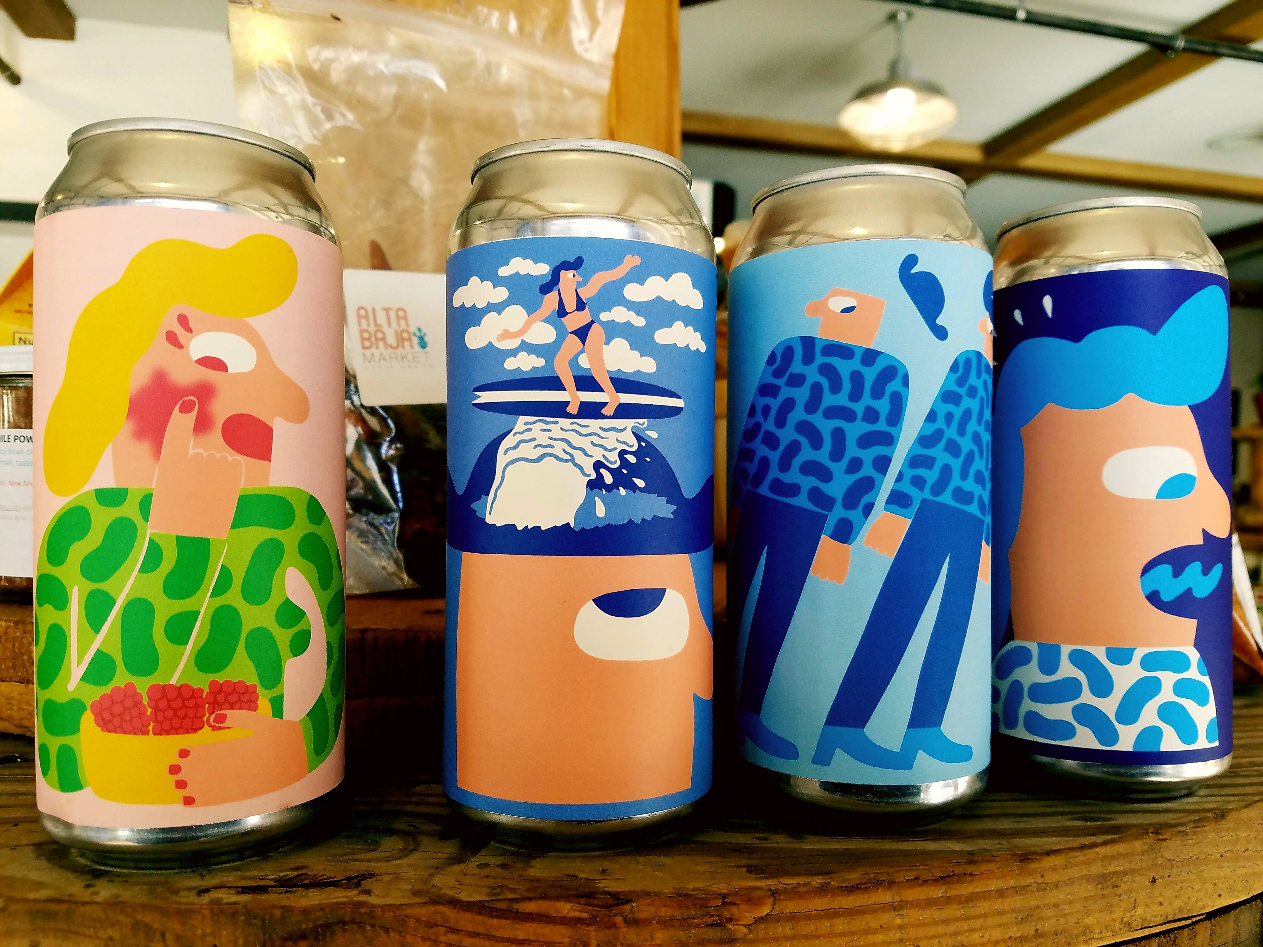
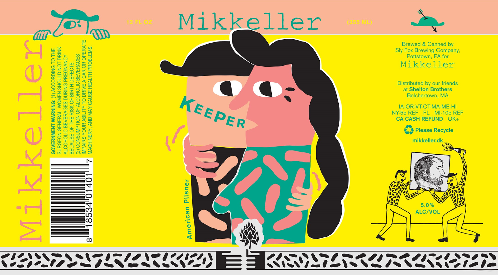
"I wasn’t a beer fanatic. I wasn’t influenced or really even familiar with what was happening in that world. I guess looking back that was somewhat of an advantage for me. I wasn’t hired on to refresh the brand or shake things up -
I was merely given a freelance job to make one label, no plan or promise for more work after that. Mikkel [the co-founder of Mikkeller] gave me a lot of freedom right from the start, and I think that’s a big reason why I’ve had success with it… I’m making art that I want to make — it’s been eight years now, and I’m still having fun with it!"
With a 9 year relationship, an instantly recognisable and striking visual style has been formed, the illustrations and design undetachable from the brand. Keith says the hardest part is keeping up with the growth of the brand. As a team of just two, himself and designer Ben Kopp, they are constantly having to churn out designs to sustain the identity that has been so lovingly created.
SECTORS: - SECONDARY (brewery). TERTIARY (distribution)
SUCCESSES: The design and look has arguably become as important as the beer itself. Super strong brand identity. Very small design operation - keeps things consistent. Very popular and contemporary, bold, graphic, humorous. Has led to further collaborations, eg with Domino Records.
Kaye Blegvad - Ceramics / Anthropologie


Ceramics for homeware brand Anthropologie
Illustrator and ceramicist Kaye Blegvad created ceramics as a personal exploration, creating homewares and collectible items before being approached by Anthropologie to create ceramic work for their brand. She has since designed jugs, measuring cups and jewellery holders for the homewares company as well as continuing to create ceramic work for her own online shop.
SECTORS: TERTIARY (retail) SECONDARY (ceramics?)
SUCCESSES: Allowing the designer creative control to create a product which still carries their visual identity and ethos. Anthropologie widely credit their designers, celebrating independent makers and giving them a platform, a nice change from many big corporate giants (eg Zara and H&M who continuously rip small independent creatives off). Very commercially appealing but still practical. Trendy.
No comments:
Post a Comment